
One of the most straightforward ways to highlight a personal brand is through color.
Beginning to associate our posts and work online with a color others start to recognize.
Over time, color will integrate with fonts, imagery, formats, and content.
All these elements together will create our personal brand character.
However, we don’t need to wait to start the process.
We can begin with our signature colors.
My Perspective
We want our color(s) to highlight who we are.
To enable others to see in us what we see in ourselves.
There is no “right” formula for color – which ones, how many, etc.
This Forbes article suggests that we only have one brand color.
Their premise is that having more than one makes it more difficult to establish your brand online.
I’m not sure if I agree with this 100%.
In fact, have three brand colors – shades of orange, green, and purple.
If I needed to select the one that best represents me, it would be orange.
A blend of red (energy) and yellow (happiness).
A color that, in my mind, conveys a creative twist and a bit of uniqueness.
There are many brand materials you might create – from social media to PowerPoint.
I think 2-3 colors provide more flexibility.
Just choose one that takes the lead.
The others will support.
Selecting Personal Brand Colors
Here’s a step-by-step guide to help you choose the colors that reflect your brand identity.
- Reflect on Your Brand Personality: Think about the personality traits and values you want to convey through your brand. Jot down 3-5 words that best reflect the message.
- Consider Your Industry and Audience: Consider the context in which others will encounter your brand. What are the norms in your industry? Do you want to fit in or stand out? What are the emotions you want to evoke? Jot down 3-5 words that describe how you want to present yourself in context.
- Select Your Primary Color: Consider how colors can influence perception. Below is a color wheel to get you thinking
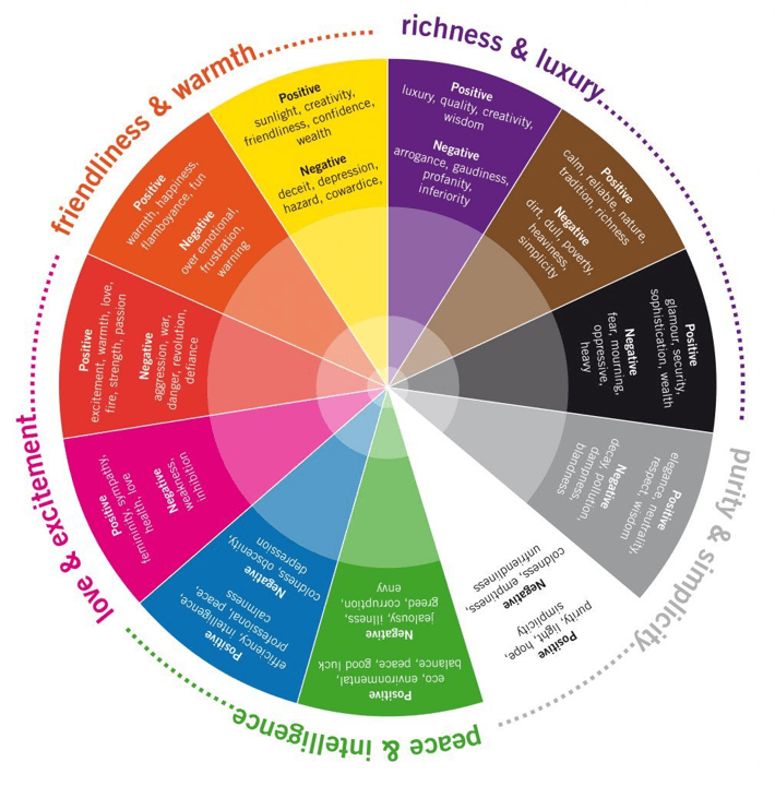
Image from Pinterest
- Look at Color Combinations: Select a primary brand color and complement it with secondary and accent colors. These combinations should be harmonious and versatile for various uses (website, social media, business cards). Common combinations include: Blue and orange (trust and originality), Green and purple (harmony and imagination); Purple and yellow (mystery and joy). Use a tool like Adobe Color or Coolors to test color schemes and find combinations that reflect your brand.
- Check Color Accessibility: Make sure your color palette is accessible, meaning it works well for people with color blindness or visual impairments. Tools like WebAIM or Stark can help you test for contrast and readability.
- Incorporate Personal Preferences: Since your personal brand reflects you, think about any personal connection to colors. Maybe there’s a color you naturally gravitate towards, or a color that has meaning to you, which could add authenticity to your brand.
- Test the Palette in Action: Before finalizing, test your colors on different mediums like websites, social media, and print. Make sure the colors remain vibrant, consistent, and communicate the right message in each format.
Your Turn
Do you have personal brand colors?
As you read this article, did certain colors come immediately to mind?
How would you use your brand colors?